Which Viz Type is Best?

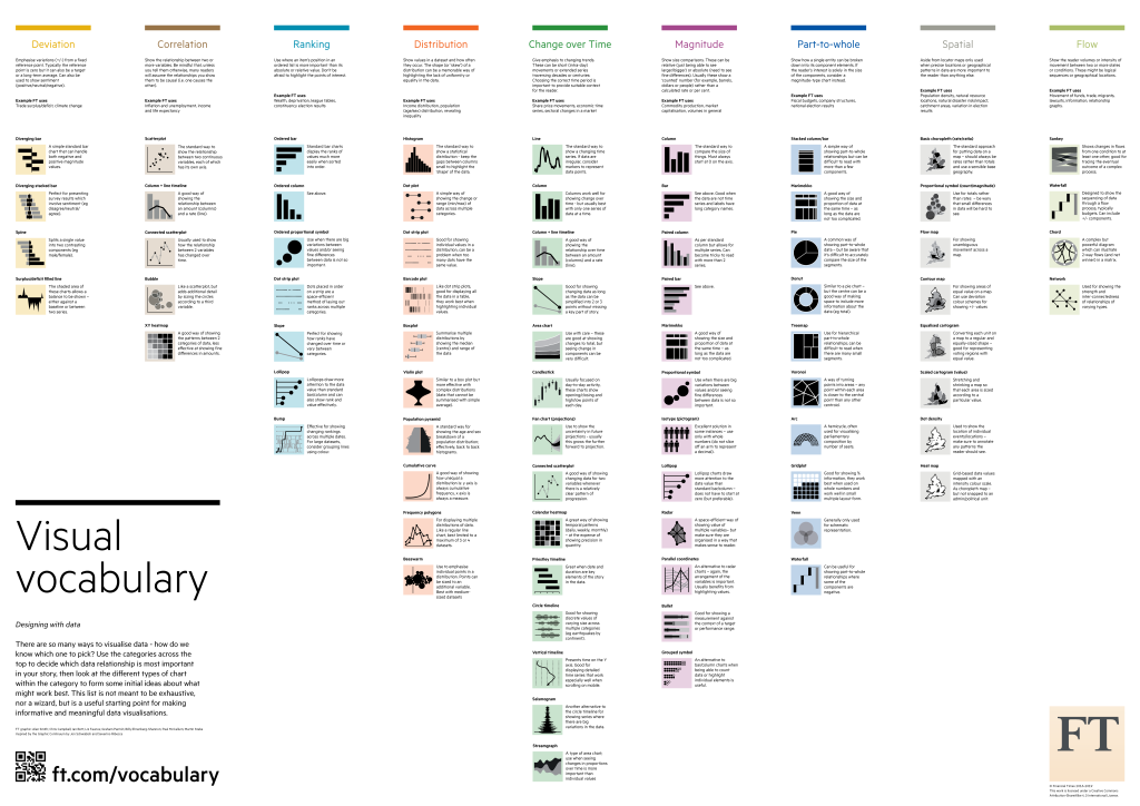
It’s important to leverage the best data visualization approach applicable to the task at hand. Here is one of the better guides I’ve found to aid your efforts. Thanks to the Financial Time Visual Journalism team for creating this. Check out their GitHub Toolbox for more!

https://github.com/ft-interactive/chart-doctor/blob/master/visual-vocabulary/Visual-vocabulary.pdf

Trying some Datawrapper

Using the Saturday Night Live cast data from Wikipedia, I tried out Datawrapper’s simple bar chart showing the season duration of all the cast members in the show’s 45 year history. I had already done some data prep in Google Sheets so it was very easy.
I like the embedding option which makes dataviz additions very easy with Datawrapper, but WordPress does not allow for embedding iFrames, so I’ve shared the link here.

Ohio State versus Michigan Football

Made a quick viz showing some of the data re: the Ohio State vs Michigan rivalry. I’d like to make another draft with updated formatting and some BANs etc.
https://public.tableau.com/profile/jpkeeton#!/vizhome/OhioStatevMichiganFootball/OSUvMichigan

Describing the process, I copied the data from Wikipedia into Google Sheets. I then split, trimmed and used some Regexreplace to get the data in shape. Then, I linked Tableau to the Google sheet and just started exploring before I found a few views I wanted to keep.

The final step was gathering the hex codes and logos to add in addition to a lot of general formatting.

My goal was to post something before tomorrow’s game. Some things I might include next time are more complex and hopefully informative vizzes.

#GoBucks!